Saturday, May 19, 2012

Top 10 overlooked fabulously gorgeous paint colors


Choosing the perfect paint color is no easy task.  As a color consultant, I guide home and business owners with selecting the ideal color for their spaces.   A while back Sherwin-Williams Paints came out with a small fan deck called Concepts in Color.  I was enamored with this spectrum of gorgeoues new colors! Yes, I get excited about color.  At first when you look at these small chips it’s easy to dismiss these colors as boring and dull but once on the wall you’re sure to fall in love. So get out your brushes and freshen up with these beauties. You can thank me later! 


RICE GRAIN SW 6155 A fresh tan with an ever slight hint of green. A perfect modernized neutral to replace the yellowy tans from years back. Sophisticated and goes with everything which makes it a great choice for hallways and foyers.


REFUGE SW 6228 The name says it all...This vivid blue has the right amount of saturated color without looking jeuvenile. Remeniscent of slate and the sea this deep color will make your dining room sing or your bedroom a flawless “retreat.” Great for powder rooms or home offices too.


ETHEREAL MOOD SW 7639 Looking at the chip this is not anything that immediately stands out, but I call this color the chameleon of the browns. Like its name, it takes on different moods. A brown that in different times of the day adopts several looks. Its a browny, greeny, earthy, slatey bundle of yum. I love this color. 

EVENING SHADOW SW 7662 Don’t be fooled by this gray. It has the ideal combination of blue and gray that makes it a perfect masculine AND feminine color. This modern cool hue pairs well with browns and blues alike.  A sure winner for a bedroom or spa bath. Simply dreamy.


PEPPERCORN SW 7674
 
A eloquent gray that reeks sophistication and class.  Make a statement with this powerful shade that can be both modern AND traditional.

FOOTHILLS SW 7514 Foothills is a intense dark brown with loads of life. Don’t be bashful to use this dark color. This timeless shade can pair up perfectly with other browns or can be complimented with a multitute of colors including oranges, turquoises and reds. Great for family rooms, home offices and bedrooms. 


GRAPEY SW 7629 Not your grandma's mauve... Pair up this juicy color with a gray, silver, or chocolate brown and you have nothing but GLAMOUR! Perfect for the home office, powder room and bedrooms.


PAVESTONE SW 7642 Feeling fickle? Not sure if you want brown or gray well here you go.  A grown up color sure to bring definition to any room. A color with longevity that you’ll love for a long time. 

CREAMY SW 7012  So here is...my favorite trim color. CREAMY,  the warm relative of it’s cool blueish SUPER WHITE cousin. Often homeowners want a crisp white.  Well CREAMY fits the bill. She is the foolproof compliment to this entire color scheme without casting too much of a color. Great color for ceilings too.


SILVERMIST SW 7621 I saved my favorite for last. It’s the perfect blue, not too dark and not too light. This blue steers away from the powder blues and creates a cooling calmness. I used this blue for a home office in a showcase home and by far it was the most inquired about color. Pair it up with black and white and you have a home run.

*Please note that the color representation may vary.


Friday, April 27, 2012

Dr. Seuss Mural "Oh, the Places You'll Go!"


The Truffula Tree to the right seconds as a growth chart.


 Recently a very good client renovated her house located on Lake Ontario creating one of the most beautiful homes that I have ever been in! Everything was new so I knew that there would be a laundry list of painting to tackle.The homeowner came to me with an idea of transforming her new playroom into a Dr. Seuss hideaway after becoming inspired by the recent release of The Lorax.  I was especially excited because Chris Renaud the director is one my very close friends from Syracuse University. So this is dedicated to you Chris. Thanks for keeping Dr. Seuss’s artwork alive! Oh, the places you'll go!


Friday, February 10, 2012

Lego themed room mural


Lego police set is Jacks favorite.
     This week I was fortunate to paint a mural for a young boy named Jack. I have never seen someone soooo enthusiastic about Legos. It was my pleasure to bring the plain walls of his room to life. His favorite Lego police set was the centerpiece of the mural. It was painted on the wall opposite his bed so that every morning he could wake up and see the mural that he art directed.  Bright colored legos are stacked high throughout the room that were color-matched from his new comforter and sheet set.  Even thought Jack's tall bookcase (below) would be covering most of this stack we still painted the legos tall just in case he moved his furniture down the road. Taping off each block is time consuming but gives a clean crisp edge.  All he needs is a few accessories from the new Lego store coming to Eastview Mall and he's all set. Enjoy your room Jack!


I love the lego clock radio


Friday, January 27, 2012

The Big Orange Splot


About ten years ago I painted in a neighbor’s house where I pretty much touched every wall with my brush. I faux finished both bathrooms, painted the vestibule, color-washed the kitchen and hallways, painted a mural in the laundry room and striped the dining room.  After each job, I would say to my friend “Are you sure that you want me to paint MORE?”  She would give me a hug and tell me that after a long day there was nothing better than coming home to a house that made her smile.  As a thank you gift she gave me a children’s paperback book that I graciously accepted but admittingly never read until my daughter was born. The book was called THE BIG ORANGE SPLOT by Daniel Manus Pinkwater. The story was about a simple man named Mr. Plumbean who lives on a very “neat” street where all the houses look exactly the same. One day, a bird flew over Mr. Plumbean’s house and spilled a gallon of orange paint making a huge mess. The neighbors freak out and demand that Plumbean paint his house back to look like all the others on the street. Instead, Mr. Plumbean transforms his house into a rainbow of colors and images.  It was what all his dreams were made of at the expense of mortifying his neighbors. 
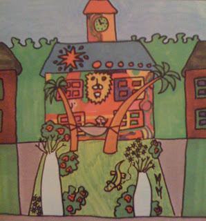
Mr. Plumbean's pimped out pad
At any given week I go on multiple color consultations where a majority of clients are timid of using color or worried about the dreaded R word. RESALE. It’s just paint and if you decided to move you can get a good deal on a five gallon bucket of antique white. That’s my answer. (I know my realtor mom and friends are cringing now). Just yesterday, I worked with a young couple that was building their “Dream House” and it wasn’t a small one by any means. After making the all the color choices she turned to me and asked “How will this look for resale?” I promptly replied with “The colors are perfect and why are you designing a house for the next owner?  Who knows you might spend the rest of your life in your house. Why not enjoy it and have it the way YOU like it?” Im not talking about turquoise and red backsplash kitchen tiles with bright yellow cabinets. Something totally out there (which I know that I can make work) but keeping your home’s staples basic and don’t be afraid of using color on the walls. I think back to a friend who complained that she had no space for her three toddlers to play but had a huge unfurnished formal living room.  I suggested that she turn that room into the kids playroom and she replied "What about Resale?” I stressed to her to enjoy her house and make it work for her family’s lifestyle. It would require a gallon of paint to transform the playroom back to that big empty room. Her children played countless hours in that room until they sold the house.

The handsome Mr. P
Now, I have a pretty “neat” house from the street but it wasn’t always like that. I remember my friend driving by and telling me “Well...., it’s in a great neighborhood.”  Others would comment “You need a lot of vision for this one.”  And “Why on earth is she leaving that great house for that piece of crap?” I heard it all.  Now, once you step into my home there is no doubt about what kind of person(s) occupy my home. I have color everywhere. Collections of my favorite things, everything from matchbooks to silhouette portraits and in between. I mix new furniture with antiques from all eras.  I surround myself in things that remind me of the special people and places that I love.  No one has a house like me and I’m pretty sure no one would want it the way it is other than me. I change it constantly to rejuvenate, invigorate and inspire.  “ My house is me, I am it. My house is where I like to be and it looks like all my dreams.”
So....If your wondering what happened to Mr Plumbean and his neighbors.... one by one, each night a neighbor would come to Plumbean’s house trying to convince him to change it.  They would sit under the palm trees and drink lemonade and talk about their dreams. The very next day the owner would set about changing his own house to fit his dreams.  
The "Neat" Street no more.
“Life is too short for white walls!” Make your space work for you. Let it tell a story about you and not worry right now about the next guy who’ll live there. Channel your inner Plumbean and feel good about the place you call HOME. 
For the complete story of Mr. Plumbean and his neighbors you can purchase a copy THE BIG ORANGE SPLOT by Daniel Manus Pinkwater. Copyright 1977 Published by Scholastic Inc. at Amazon.com. It’s a keeper.

If you are or know of a Mr. Plumbean, feel free to email me a picture of the house. No names necessary.

Thursday, January 19, 2012

Top Picks and Trends for 2012

More than 50 years ago, AmericasMart started with a vision - today AmericaMart is the World's Global Wholesaler Market. Everything that you need is all in one place. There, thousands of manufacturers, reps and artist display and take orders for the entire retail world. Just about everything that you find in a store is there and it is THE best place to see what’s next in design and trends.  Le’s start with COLOR, my favorite!


YOUR FIRST CRAYON BOX
Basically, think back to your first box of crayons and you will find all the answers to the hottest colors this year.  Chinese red, tangerine orange, lemon yellow, turquoise blue, grass green, black and white.  All bright and saturated with the exceptions of a few tamed down colors. Dusty purple (the new Mauve) and a gray taupe. A perfect blend of earthy brown with a touch of gray.

This delicious collection is from OOMPH


I feel in love with these amazing bangles from www.wimberlyinc.com

two's company showroom 


LET THERE BE WHITE!
High gloss white furniture and accessories. The perfect back drop for any color. Want to change your decor well white will let you accessorize with any color scheme.


NOT YOUR GRANDMA’S GOLD AND BRASS
That shiney stuff is back and it is as luxurious as ever. It’s a softer gold and brushed brass that just reeks elegance and charm.


BURLAP and BARK
Everywhere you go look for burlap, linen and all things organic. These amazing tiles are made from wood chips that have been artfully put together on a web backing and have been coated with a wax protective seal. They are pliable and can be used to cover almost anything. At $14.95 a square you can adhere these bad boys to anything... a glass vase, old table , accent wall or column, even a kitchen backsplash.


perfect example of organic meets modern


FRANCHOPHILES UNITE
Fans of Paris and all things french look out for the updated version of country french.  Look for an abundance of Eiffel Tower images, vintage egg basket chandeliers and gray-washed distressed furniture. The language of love is in.


RECLAIMED GREEN DESIGN
An old teapots and egg baskets turned into lamps and chandeliers. Tennis racquets become mirrors. Old doll parts be come chic candlesticks. You name it. Nothing is thrown away anymore. 


BOHO CHIC
Hippie chicks unite for this fresh approach on spirituality, color and new age of living.


The Good Life line. 
These hand carved indian blocks can be used to make  everything from note cards to one of a kind custom fabrics. 
THE WRITTEN WORD
Inspiration words and thought as artwork have been creeping up on the design world for a few years now under a country decorating style. Well, they have entered the design world at full steam in every genre of decor. Look for single words to long phrases as artwork and the single letter as a piece of art. Its a perfect way to have your home tell something about you.